

Built with intent.
Powered by culture.
Nothing happened by accident, everything was the result of obsession. This project came together at a time where it wasn’t supposed to exist, but grew from an vision that couldn’t be ignored.
From the name, to the branding, the strain selection, packaging, merch, and social presence, every piece was crafted to foster community.
It became the most iconic and imitated brand in Canadian Cannabis because it didn’t follow a blueprint, it became the blueprint.
Introduction
I created Ghost Drops to feel bigger than cannabis.
nothing was by accident, everything was by obsession

It all starts with an idea


Creative Direction, Naming, Brand Identity
The Ghost Drops logo was intentionally crafted to break the mold of traditional cannabis branding. As the originator of the name and creative director behind the visual identity, my goal was to build a brand that didn’t look like a weed company it felt more like a secret society mixed with a street lifestyle label. The name itself is intentionally cryptic, It hinted at the brand’s original roots as a discreet service. Almost like a ghost had dropped off your package. Allowing for broad cultural resonance beyond cannabis. It hints at something rare, exclusive, and for those in-the-know.
The logo uses hand-drawn, street-style script to convey movement, personality, and authenticity. The exaggerated swashes and drippy tail subtly nod to both graffiti culture and the idea of something “dripping” or “ghosting” a term familiar in both cannabis and urban circles. It balances clean execution with raw energy, helping position Ghost Drops as a cultural disruptor that lives at the intersection of streetwear, music, and cannabis.
Designer - SFinks
Year - 01/09/2017

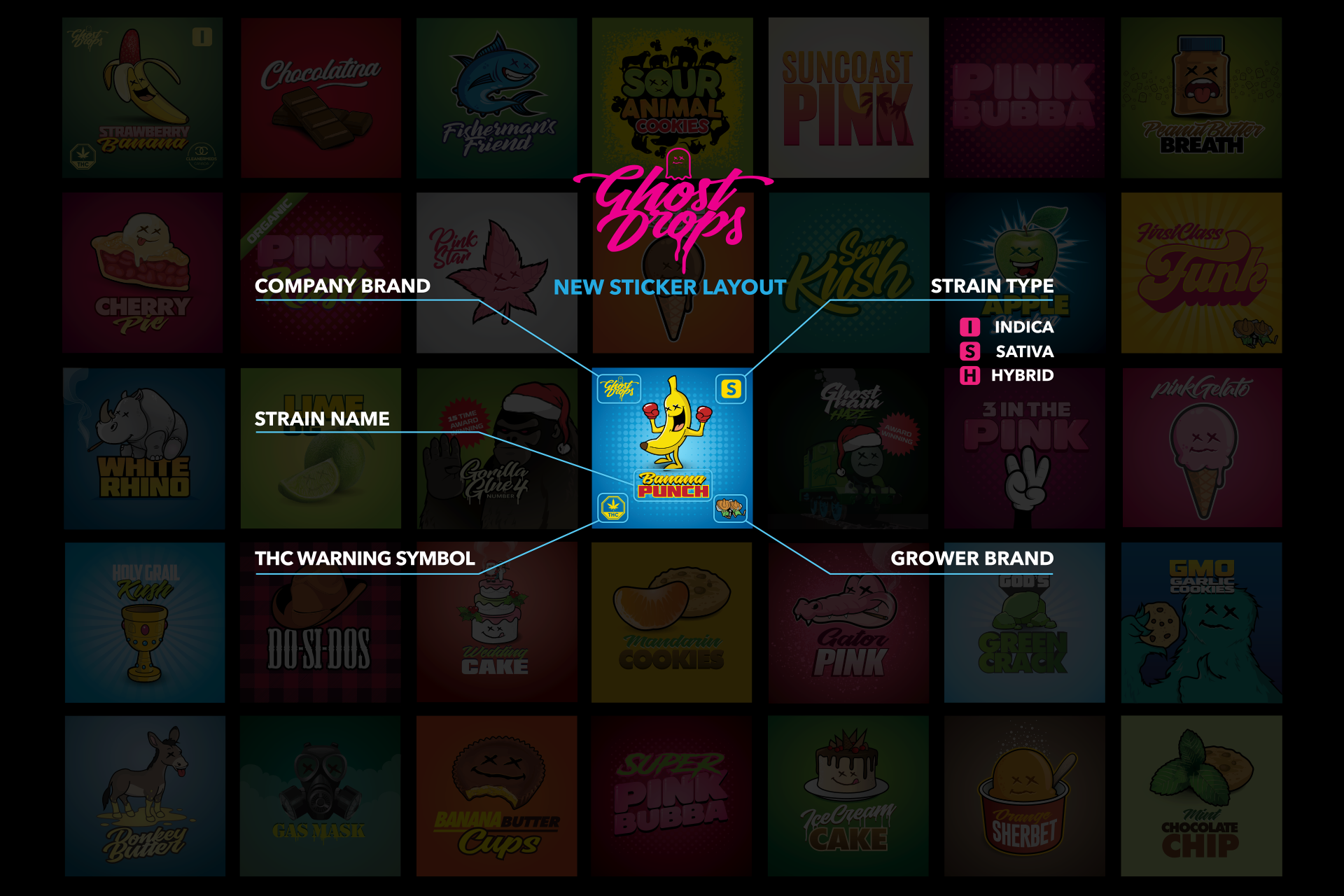
The worlds first strain sticker
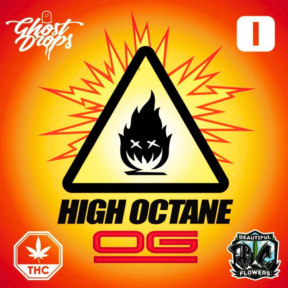
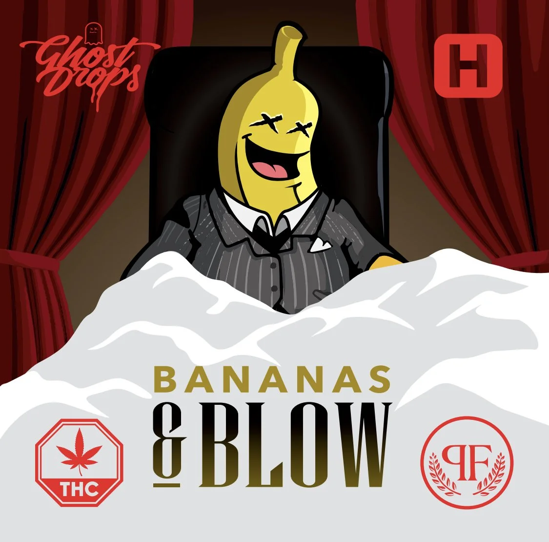
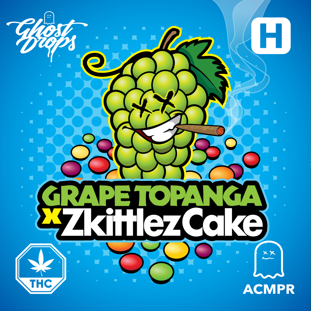
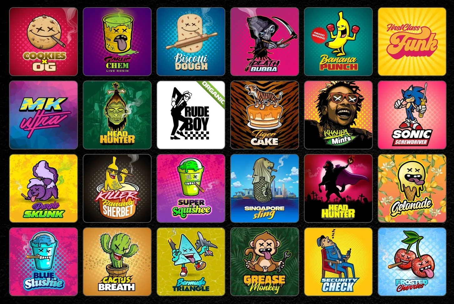
In 2018, I introduced the first-ever functional illustrated strain stickers in cannabis turning every purchase into a collectible. Each sticker featured custom artwork tied directly to the strain and included a 5-point schematic designed to highlight grower transparency and elevate consumer education. I led the creative direction on every single one of the hundreds of designs, meticulously crafting each to reflect both quality and cultural relevance while ensuring a strong social presence.
More than just packaging, these stickers became a powerful workaround to strict social media restrictions. By leading with art and culture instead of product shots, we built hype, drove engagement, and found a way to market creatively in a tightly regulated space. This approach didn’t just brand products, it redefined how cannabis could be promoted, packaged, and remembered.
Designer: SFinks
Strain Stickers
-
![]()
FirstClass Funk
-
![]()
White Runtz S1
-
![]()
Pave S1
-
![]()
Super Squishee
-
![]()
High Octane OG
-
![]()
Glazed Donut
-
![]()
Purple Punchsicle
-
![]()
Banana's & Blow
-
![]()
Spicy Tuna
-
![]()
Donny Burger
-
![]()
Cactus Breath
-
![]()
Frosted Cherries
-
![]()
Rockstar
-
![]()
Gelonade
-
![]()
Face Mints
-
![]()
Grape Top x Zkittlez Cake
-
![]()
Head Hunter
-
![]()
Pink goo
-
![]()
Gas Pack
-
![]()
Korean BBQ
-
![]()
Z Splitter
-
![]()
Sherbanger 22
-
![]()
Purple Skunk
-
![]()
Banana Punch


Brand Identity
-
![]()
WORDMARK LOGO
This is the main logo. Designed to feel more like a secret society than a cannabis brand. Bold, clean, and culture-first, it became the foundation of the brand’s visual identity and helped set the tone for everything that followed.
-
![]()
LETTERMARK LOGO
I created this simplified ghost icon as a secondary mark for Ghost Drops. Designed for small-scale use across accessories, tags, and brand stamps. Clean, bold, and instantly recognizable, it distilled the brand’s attitude into a minimal form, making it versatile for everything from embroidery to digital favicons while still keeping the culture intact
-
![]()
Strain Illustrated Background Element
I led the creative & worked with the designer the develop this unique illustrated strain mash up design. This is one the most used elements for backgrounds, wallpapers, social posts & accessories. A textured wall built from hundreds of past strain releases, each featuring the brands signature illustrated typography
-
![]()
Ghost Drips
Led the creative and worked with the designer to create this bold visual anchor, the signature pink drip is instantly recognizable. More than just an aesthetic, it’s a visual cue that sets the brand apart in a crowded market. The unique colorway and fluid form create immediate recall on shelves and social feeds, helping cement brand loyalty and cultural relevance. It’s playful, rebellious, and cant be missed.
-
![]()
Aerosol Spray Marks
An intentional nod to graffiti culture, the spray element ties Ghost Drops directly to its roots. The raw splatter effect brings texture, edge, and a sense of rebellion to the visual identity, reminding the audience where the brand came from. Beyond style, it reinforces authenticity and connects with a community that values street credibility over corporate polish. It's not clean, it’s culture
-
![]()
Illustrated Strain Stickers
I invented a 5-point schematic breakdown on each strain highlighting important info and feel making it easily digestible, fun, and entirely new to the space.
-
![]()
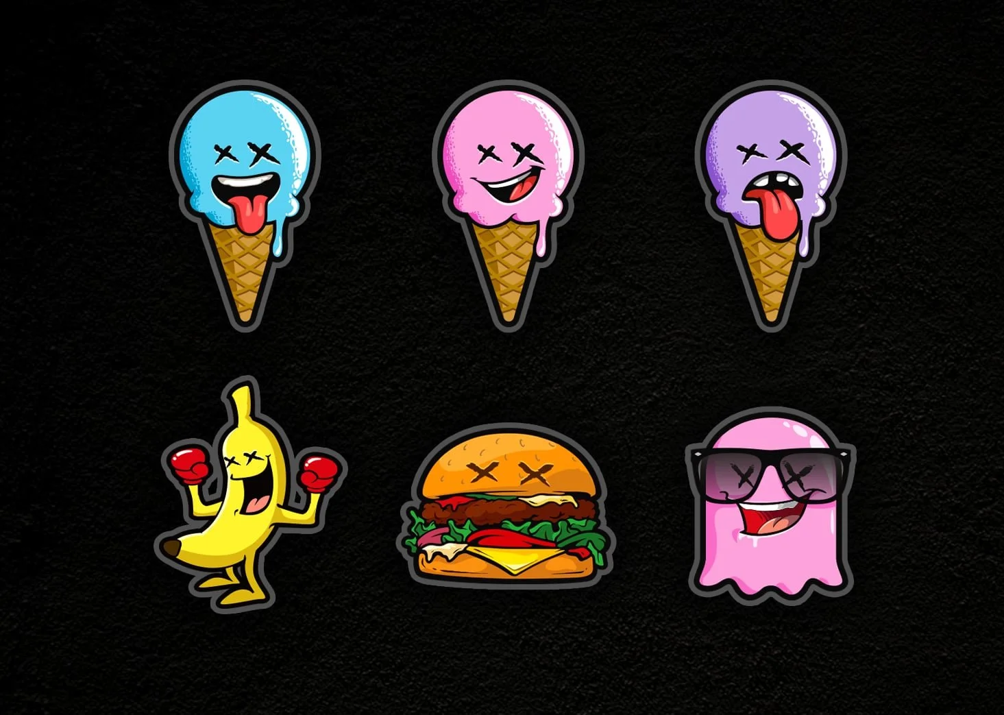
Illustrated Strain Caricatures
I provided the creative for these custom characters that brought each strain to life, turning genetics into personalities. First introduced on collectible strain stickers, they became key brand touch points you could find appearing on air fresheners, apparel, and more. Bold, playful, and instantly recognizable, these designs helped Ghost Drops stand out and build real connection with its community.


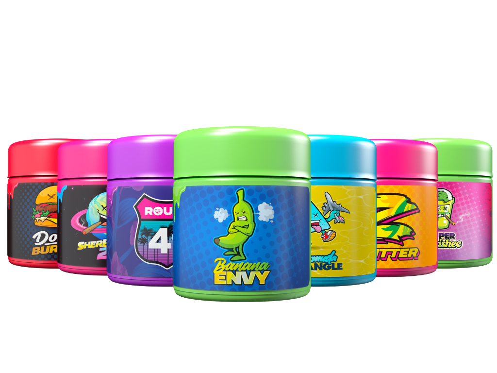
I led the creative direction for Ghost Drops’ packaging, bringing bold, collectible energy to every SKU. Each product featured vibrant colorways and original caricature art tied to the strain, making every jar and pre-roll tube instantly identifiable. The designs turned packaging into brand storytelling; merchandising shelf appeal while reinforcing strain identity and cultural relevance. This approach made Ghost Drops products stand out in a saturated market and helped build a loyal collector-style customer base

Product Packaging

Accessories & Merch
-
![]()
rolling papers
I designed Ghost Drops' ultra-thin rice papers to match the brand's premium feel and attention to detail. Each pack featured ghost watermarks for an even burn, a magnetic closure for durability, and a wraparound design showcasing illustrated glow in the dark strain branding.
-
![]()
Ceramic Grinders
I developed the Ghost Buster. A custom 4-piece ceramic grinder, as both a premium accessory and a brand statement. Designed for performance and presentation, it featured our logo embossed on the lid and came in collectible glow in the dark packaging wrapped with the names of iconic Ghost Drops strains. This piece elevated the accessory game, giving fans something functional, high-quality, and unmistakably on-brand.
-
![]()
Newera Baseball Caps
Leveraging my relationship with New Era from my work at KOTD, I led the creative while securing an exclusive partnership to produce custom Ghost Drops hats, making us one of the first cannabis brands to collaborate directly with New Era. Each design fused streetwear aesthetics with our brand DNA, turning headwear into a premium extension of the Ghost Drops identity and giving fans a new way to rep the culture.
Designs by: Leo Rodriquez -
![]()
Clothing & Apparell
I collaborated with Avid Apparel and Roopa Knitting Mills to create Ghost Drops’ official clothing line. We brought strain characters to life through bold, streetwear-quality pieces—combining premium materials with our distinct visual identity. Each item was designed to feel collectible, wearable, and rooted in culture, helping expand Ghost Drops from a cannabis brand into a lifestyle movement.
-
![]()
Rolling TraYS
I led the creative & designed a series of custom rolling trays featuring Ghost Drops’ collectible characters, blending function with brand identity. Set against a brick wall backdrop with neon-lit vibes, the trays became more than accessories, hey were statement pieces. This extended the brand’s personality into everyday rituals, turning a standard tool into a collectible item fans actually wanted to flex.
-
![]()
Bic Lighters
I led the creative direction for Ghost Drops’ custom Bic lighters, transforming a simple functional item into a cultural brand statement. Each design featured bold, GD caricature artwork and high-contrast colour ways, making them both collectible and instantly recognizable.
-
![]()
Air Fresheners
I developed a line of Ghost Drops air fresheners that brought strain characters to life in a new way, pairing each design with a scent inspired by the strain it represented. This not only expanded the brand into lifestyle but also created a sensory link to the product experience. Fun, collectible, and on-brand, they became a subtle flex for fans and a smart way to extend Ghost Drops into cars, homes, and everyday life.
-
![]()
Mood Mats
I led the creative direction for Ghost Drops custom mood mats, turning functional dab station protectors into collectible art pieces. Each piece featured intricate, mandala-inspired designs with bold colour palettes and the Ghost Drops logo subtly embedded, making them both practical and visually striking for consumers. Designed By: Sfinks


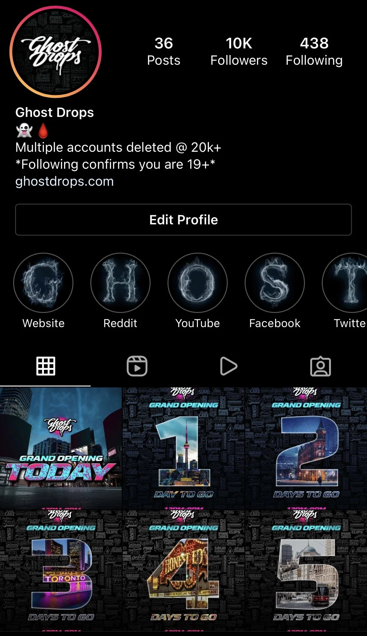
Social Strategy & ‘Organik’ Growth


Building hype under heavy restrictions.
Marketing cannabis on social media meant working under serious limitations. Shadowbans, takedowns, and content bans were constant threats. So I built a system that let Ghost Drops grow fast and in your face without triggering the algorithm.
I used my personal pages with 1,000,000+ combined followers & friendships with other influencers to slow roll the company in a natural way leveraging my community and outreach while using our custom strain stickers as a covert brand vehicle. It was a way to drop content, showcase products and engage fans without ever showing cannabis on the front carousel. Every drop had its own illustrated identity and each post felt like part of a collectible community hub.
The strategy was simple but effective: drops always went live around noon, with Stories using countdown timers to build anticipation. We created FOMO by limiting product supply and giving each drop a unique identity paired with full grower transparency to build trust. Every caption was creatively engineered to drive traction. No ads. Just strategy and timing & an active community.
Using my social status to share posts, followers would flood the comments, pushing posts to 200–800+ comments, all organic. This helped us beat the algorithm without a single ad dollar spend while driving natural engagement to our partners which ultimately created the #GhostFam community.
My strategy of providing transparency made every single post feel like an introduction to wizards behind the curtains. We gave growers front-page love on every drop with built in transparency and gave the culture something to get excited about drop after drop.

Wordmarks
-
![]()
Trap Pack
-
![]()
Slimeball
-
![]()
M.O.M.
-
![]()
Ghost Gummies
-
![]()
Revolver Pack
-
![]()
Exotics


Collectible Strain Cards
I led the creative on the first-ever collectible strain cards, included with every purchase as a unique brand touchpoint. Each featured bold visuals, grower and genetic info, and a QR code linking to a consumer survey. Beyond collectibility, they became a CRM tool to build our email list and capture real-time consumer data in a compliant, culture-driven format.
- Creative Direction: Travis Fleetwood
- Illustration: Steve Finch
- Photography: Max Kirsh & Hector Galbraith
- Design Execution: Saro Creative

Retail Launch Event
For Ghost Drops’ retail debut, I organized and promoted a launch that drew over 500 attendees to a single store. The event blurred the line between product drop and music culture, featuring exclusive merch, giveaways, performances & games. Our store, previously had partnered with 6ixDonutz whose brand aesthetic and product aligned perfectly with Ghost Drops leveraging their massive social influence combined with my own to amplify buzz. The collaboration created an unexpected, share-worthy experience that drove massive foot traffic, organic social coverage, and positioned Ghost Drops as a cultural leader.


Fastest selling in Canadian History
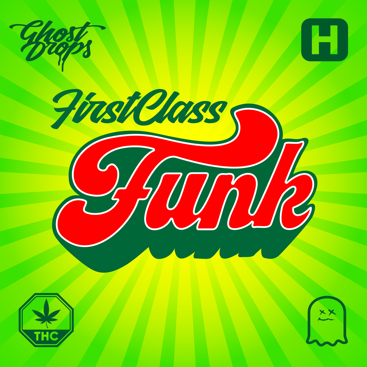
Holding the title as the two fastest-selling SKUs in Canadian cannabis history, and the premium category’s top performers with each surpassing over 300,000 units moved. I personally selected and curated these strains from the legacy market, partnering with Cultivating Happiness to secure the cuts. First Class Funk was first championed by Unlicensed Producer on the Ghost Drops platform, while Z Splitter gained momentum through Phat Pharmer before becoming a nationwide staple. I also led the creative on all marketing assets, helping skyrocket their popularity and cement their place as record-breaking strains.

First Class Funk

Z-Splitter

#1 Most Searched Brand on OCS
Ghost Drops launched onto the OCS with unprecedented demand, ranking as the #1 most searched brand for five consecutive months (January–May). Consumer search data was later discontinued, but during its run Ghost Drops consistently outperformed established players and set the benchmark for hype driven cannabis launches in Canada.


Ghost Drops Investment vs Revenue
Legacy 2018-2021 vs OCS 2022

AWARDS &
RECOGNITIONS
-
 ADCANNMARKETING CAMPAIGN OF THE YEARGhost Drops - MOM Is Back2023
 -
GROW UPPRODUCT OF THE YEARGhost Drops - First Class Funk2022
-
ADCANNCANNABIS BRAND MARKETER OF THE YEARGhost Drops - Travis Fleetwood - Finalist2022
