
It all starts with an idea


Creative Direction, Naming, Brand Identity
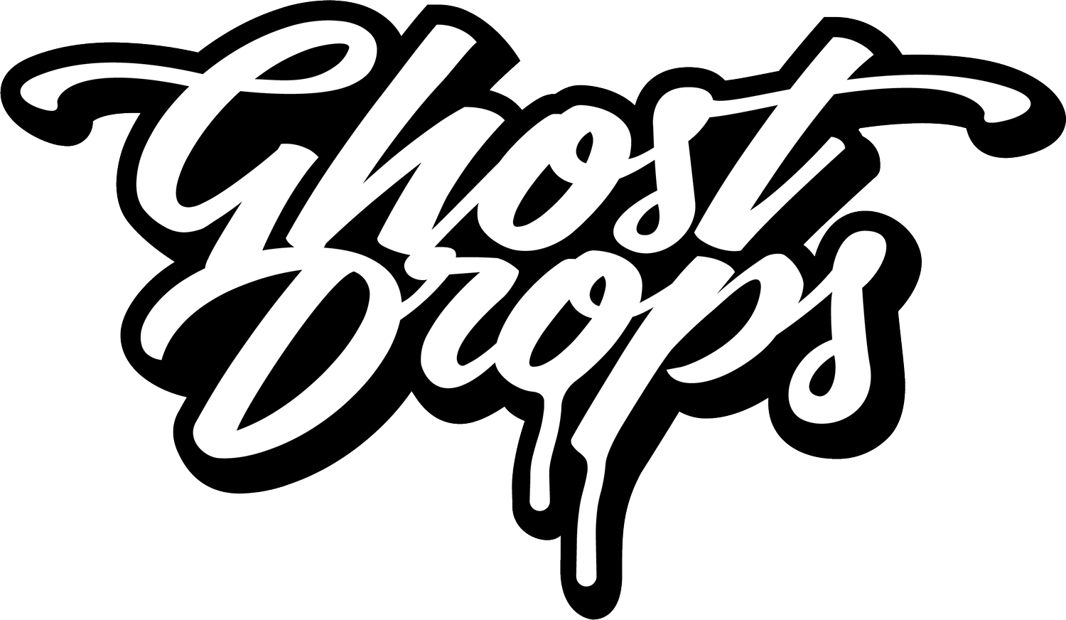
The Ghost Drops logo was intentionally crafted to break the mold of traditional cannabis branding. As the originator of the name and creative director behind the visual identity, my goal was to build a brand that didn’t look like a weed company it felt more like a secret society or an underground lifestyle label. The name itself is intentionally cryptic, It hinted at the brand’s original roots as a discreet service. Almost like a ghost had dropped off your package. Allowing for broad cultural resonance beyond cannabis. It hints at something rare, exclusive, and for those in-the-know.
The logo uses hand-drawn, street-style script to convey movement, personality, and authenticity. The exaggerated swashes and drippy tail subtly nod to both graffiti culture and the idea of something “dripping” or “ghosting” a term familiar in both cannabis and urban circles. It balances clean execution with raw energy, helping position Ghost Drops as a cultural disruptor that lives at the intersection of streetwear, music, and cannabis.
Designer - Steve Finch
Year - 01/09/2017
-
![]()
HERO LOGO
This is the main logo. Designed to feel more like a secret society than a cannabis brand. Bold, clean, and culture-first, it became the foundation of the brand’s visual identity and helped set the tone for everything that followed.
-
![]()
Secondary logo Mark
I created this simplified ghost icon as a secondary mark for Ghost Drops. Designed for small-scale use across accessories, tags, and brand stamps. Clean, bold, and instantly recognizable, it distilled the brand’s attitude into a minimal form, making it versatile for everything from embroidery to digital favicons while still keeping the culture intact
-
![]()
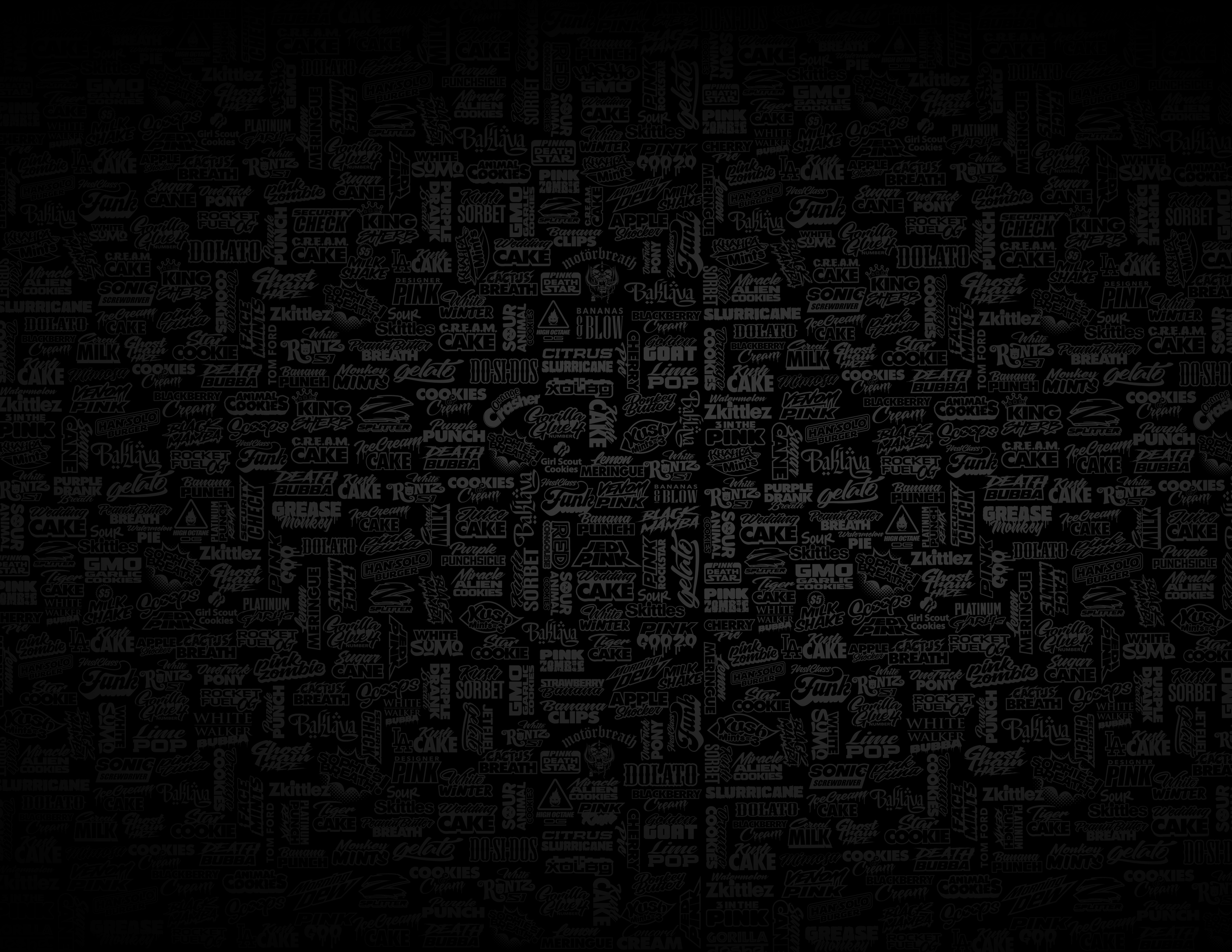
Strain Illustrated Background Element
This is one the most used elements for backgrounds, wallpapers, social posts & accessories. A textured wall built from hundreds of past strain releases, each featuring the brands signature ullustrated typography
-
![]()
Ghost Drips
A bold visual anchor, the signature pink drip is instantly recognizable. More than just an aesthetic, it’s a visual cue that sets the brand apart in a crowded market. The unique colorway and fluid form create immediate recall on shelves and social feeds, helping cement brand loyalty and cultural relevance. It’s playful, rebellious, and cant be missed.
-
![]()
Aerosol Spray Marks
An intentional nod to graffiti culture, the spray element ties Ghost Drops directly to its roots. The raw splatter effect brings texture, edge, and a sense of rebellion to the visual identity, reminding the audience where the brand came from. Beyond style, it reinforces authenticity and connects with a community that values street credibility over corporate polish. It's not clean, it’s culture
-
![]()
Illustrated Strain Stickers
I invented a 5-point schematic breakdown on each strain highlighting important info and feel making it easily digestible, fun, and entirely new to the space.
-
![]()
Illustrated Strain Caricatures
I provided the creative for these custom characters that brought each strain to life, turning genetics into personalities. First introduced on collectible strain stickers, they became key brand touch points you could find appearing on air fresheners, apparel, and more. Bold, playful, and instantly recognizable, these designs helped Ghost Drops stand out and build real connection with its community.


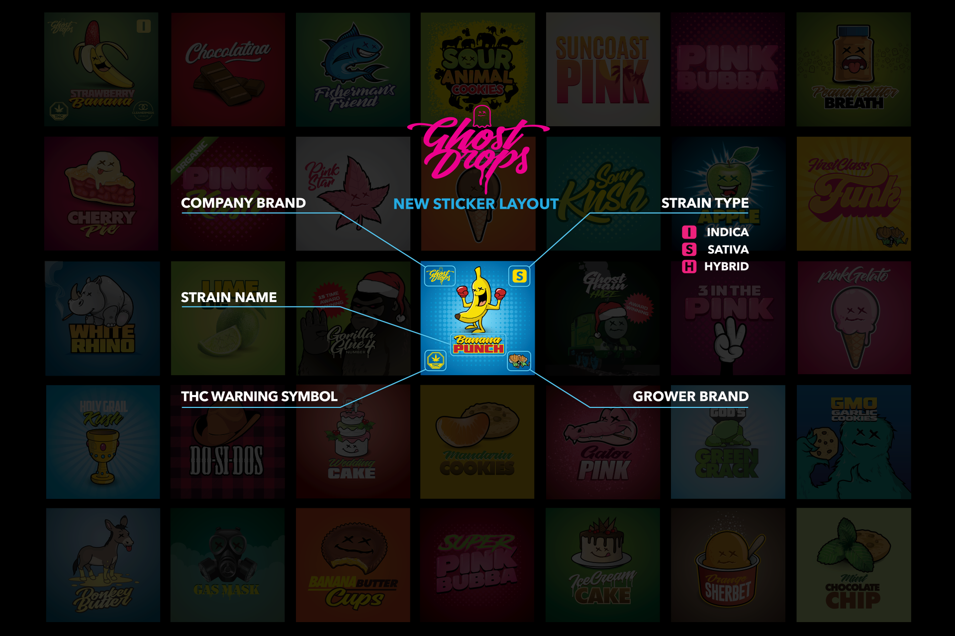

The worlds first ever strain sticker
I introduced the first-ever illustrated strain stickers in cannabis, turning every purchase into a collectible. Each design featured custom artwork tied to the strain and included a 5-point schematic that highlighted grower transparency. Beyond packaging, they became a key tool for navigating heavy social media restrictions. By leading with art and culture instead of product shots, the brand was able to build hype, drive engagement, and market creatively in a tightly regulated space. This approach redefined how cannabis could be promoted, packaged, and remembered.
Designer: Steve Finch

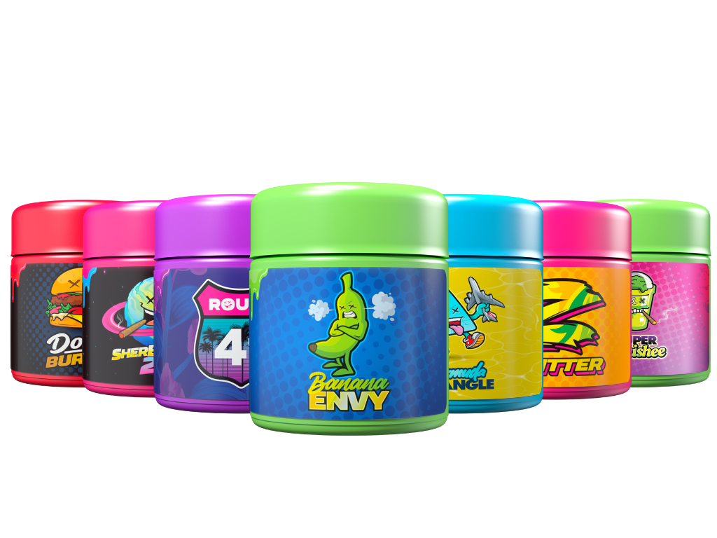
Product Packaging
I led the creative direction for Ghost Drops’ packaging, bringing bold, collectible energy to every SKU. Each product featured vibrant colorways and original caricature art tied to the strain, making every jar and pre-roll tube instantly identifiable. The designs turned packaging into brand storytelling: merchandising shelf appeal while reinforcing strain identity and cultural relevance. This approach made Ghost Drops products stand out in a saturated market and helped build a loyal collector-style customer base

Accessories
-
![]()
Custom rolling papers
I designed Ghost Drops' ultra-thin rice papers to match the brand's premium feel and attention to detail. Each pack featured ghost watermarks for an even burn, a magnetic closure for durability, and a wraparound design showcasing illustrated glow in the dark strain branding.
-
![]()
Ceramic Grinders (Ghost Busters)
I developed the Ghost Buster. A custom 4-piece ceramic grinder, as both a premium accessory and a brand statement. Designed for performance and presentation, it featured our logo embossed on the lid and came in collectible glow in the dark packaging wrapped with the names of iconic Ghost Drops strains. This piece elevated the accessory game, giving fans something functional, high-quality, and unmistakably on-brand.
-
![]()
New Era Baseball Caps
Leveraging my relationship with New Era from my work at KOTD, I secured an exclusive partnership to produce custom Ghost Drops hats, making us one of the first cannabis brands to collaborate directly with New Era. Each design fused streetwear aesthetics with our brand DNA, turning headwear into a premium extension of the Ghost Drops identity and giving fans a new way to rep the culture.
-
![]()
Clothing & Apparell
I collaborated with Avid Apparel and Roopa Knitting Mills to create Ghost Drops’ official clothing line. We brought strain characters to life through bold, streetwear-quality pieces—combining premium materials with our distinct visual identity. Each item was designed to feel collectible, wearable, and rooted in culture, helping expand Ghost Drops from a cannabis brand into a lifestyle movement.
-
![]()
Rolling TraYS
I led the creative & designed a series of custom rolling trays featuring Ghost Drops’ collectible characters, blending function with brand identity. Set against a brick wall backdrop with neon-lit vibes, the trays became more than accessories, hey were statement pieces. This extended the brand’s personality into everyday rituals, turning a standard tool into a collectible item fans actually wanted to flex.
-
![]()
Air Fresheners
I developed a line of Ghost Drops air fresheners that brought strain characters to life in a new way, pairing each design with a scent inspired by the strain it represented. This not only expanded the brand into lifestyle but also created a sensory link to the product experience. Fun, collectible, and on-brand, they became a subtle flex for fans and a smart way to extend Ghost Drops into cars, homes, and everyday life.


strain cards
I created collectible strain cards as a unique brand touchpoint included with every purchase. Each card featured bold visuals, detailed grower and genetic info, and a custom QR code linking to a consumer questionnaire. This not only extended the collectible feel of the brand, but also became a smart tool for building our email list and capturing real-time consumer data all within a compliant, culture driven format.
